方式一:浮动布局 float
所谓的浮动就是会使元素向左或向右移动,其周围的元素也会重新排列。类似于往一个容器中注水满水,里面的物体都浮动到最上层,之后依次排列。
关键代码:
<!DOCTYPE html>
<html lang="en">
<head>
<meta charset="UTF-8">
<meta name="viewport" content="width=device-width, initial-scale=1.0">
<title>浮动布局_float</title>
<style type="text/css">
.container{
width: 1100px;
height: 880px;
border: 1px solid rgb(220, 217, 218);
margin: 0px auto;
background-color: rgb(233, 213, 213);
}
/* 设置头部样式 */
.title{
width: 1000px;
height: 100px;
border: 1px solid rgb(220, 217, 218);
margin: 10px auto;
background-color: pink;
}
/* 设置导航样式 */
.nav{
width: 1000px;
height: 120px;
margin: 10px auto;
background-color: rgb(220, 36, 107);
}
/* 设置主体内容样式 */
.content{
width: 1000px;
height: 500px;
background-color: rgb(186, 171, 171);
margin: 10px auto;
}
/* 设置主体内容左列的样式 */
.content .content-left{
width: 200px;
height: 100%;
background-color: rgb(235, 210, 13);
margin-right: 20px;
float: left;
}
/* 设置主体内容的中间的内容的样式 */
.content .content-center{
width: 400px;
height: 100%;
background-color: rgb(233, 113, 161);
float: left;
margin-left: 20px;
}
/* 设置主体内容右列的样式 */
.content .content-right{
width: 310px;
height: 100%;
background-color: rgb(58, 195, 51);
float: right;
}
/* 设置底部 */
.bottom{
width: 1000px;
height: 100px;
background-color: rgb(138, 135, 134);
margin: 0px auto;
}
</style>
</head>
<body>
<div class="container">
<div class="title">这是头部</div>
<div class="nav">这是导航</div>
<div class="content">
<div class="content-left">主体内容的左列</div>
<div class="content-center">主体内容的中间内容</div>
<div class="content-right">主体内容的右列</div>
</div>
<div class="bottom">这是底部</div>
</div>
</body>
</html>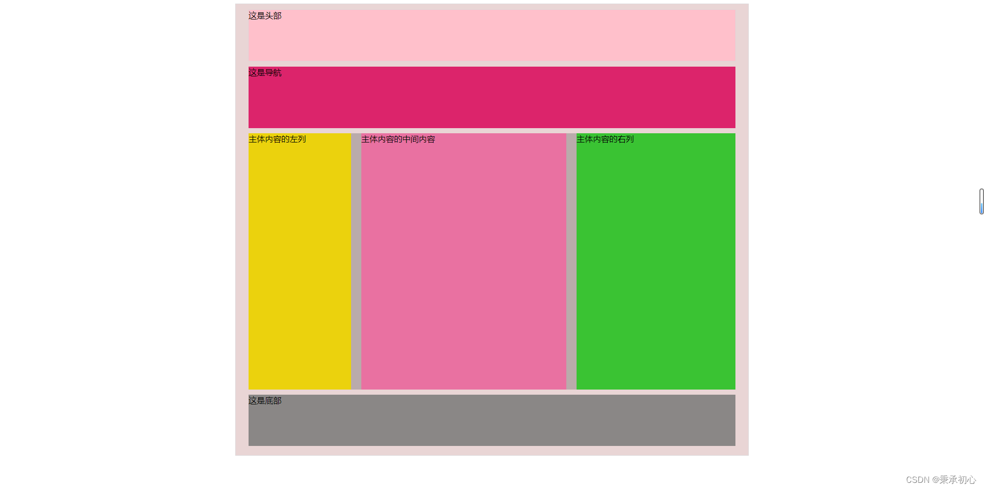
缺点:一般要计算页面中每个模块的具体大小和位置,更复杂的布局还要借助position和display,而且代码量较大。
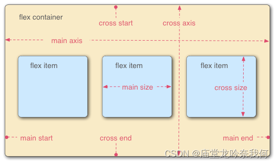
方式二:弹性布局 flex
Flex 是 Flexible Box 的缩写,意为”弹性布局“,用来为盒状模型提供最大的灵活性。简单来说就是一套布局框架,我们只需要使用里面的语法,不用自己计算就能完成页面布局。
关键代码:
代码展示:
<!DOCTYPE html>
<html lang="en">
<head>
    <meta charset="UTF-8">
    <meta name="viewport" content="width=device-width, initial-scale=1.0">
    <title>弹性布局_flex</title>
    <style type="text/css">
        .container{
            width: 1100px;
            height: 880px;
            border: 1px solid rgb(220, 217, 218);
            margin: 0px auto;
            background-color: rgb(233, 213, 213);
        }
        /* 设置头部样式 */
        .title{
            width: 1000px;
            height: 100px;
            border: 1px solid rgb(220, 217, 218);
            margin: 10px auto;
            background-color: pink;
        }
        /* 设置导航样式 */
        .nav{
            width: 1000px;
            height: 120px;
            margin: 10px auto;
            background-color: rgb(220, 36, 107);
        }
        /* 设置主体内容样式 */
        .content{
			width: 1000px;
            height: 500px;
            background-color: rgb(186, 171, 171);
            margin: 10px auto;
			display: flex;
			justify-content: space-between
        }
        /* 设置主体内容左列的样式 */
        .content .content-left{
            width: 200px;
            height: 100%;
            background-color: rgb(235, 210, 13);

        }
        /* 设置主体内容的中间的内容的样式 */
        .content .content-center{
            width: 400px;
            height: 100%;
            background-color: rgb(233, 113, 161);

        }
        /* 设置主体内容右列的样式 */
        .content .content-right{
            width: 310px;
            height: 100%;
            background-color: rgb(58, 195, 51);
        }

        /* 设置底部 */
        .bottom{
            width: 1000px;
            height: 100px;
            background-color: rgb(138, 135, 134);
            margin: 0px auto;
        }
        </style>
</head>
<body>
    <div class="container">
        <div class="title">这是头部</div>
        <div class="nav">这是导航</div>
        <div class="content">
            <div class="content-left">主体内容的左列</div>
            <div class="content-center">主体内容的中间内容</div>
            <div class="content-right">主体内容的右列</div>
        </div>
        <div class="bottom">这是底部</div>
    </div>
</body>
</html>效果图:

优点: 不用去精确计算页面中每个模块的具体位置和大小就能完成更为复杂的布局。
原文地址:https://blog.csdn.net/m0_60821938/article/details/129131206
本文来自互联网用户投稿,该文观点仅代表作者本人,不代表本站立场。本站仅提供信息存储空间服务,不拥有所有权,不承担相关法律责任。
如若转载,请注明出处:http://www.7code.cn/show_36068.html
如若内容造成侵权/违法违规/事实不符,请联系代码007邮箱:suwngjj01@126.com进行投诉反馈,一经查实,立即删除!
声明:本站所有文章,如无特殊说明或标注,均为本站原创发布。任何个人或组织,在未征得本站同意时,禁止复制、盗用、采集、发布本站内容到任何网站、书籍等各类媒体平台。如若本站内容侵犯了原著者的合法权益,可联系我们进行处理。