大家好, 我是’菜鸟’,今天给大家带来几种css盒子居中的方法!
1.flex布局设置居中
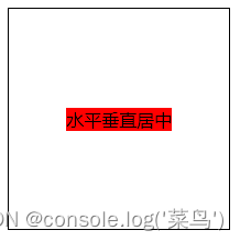
利用弹性布局(flex),实现水平居中,其中justify-content 用于设置弹性盒子元素在主轴(横轴)方向上的对齐方式
<style>
.box {
width: 200px;
height: 200px;
border: 1px solid;
display: flex;
align-items: center; // 纵轴对齐方式,默认是纵轴 子元素垂直居中
justify-content: center; //纵轴对齐方式,默认是纵轴
}
.one {
background: red;
}
</style>
<div class="box">
<div class="one">水平垂直居中</div>
</div>运行后:
2.flex-给子项设置
<style>
.box {
width: 200px;
height: 200px;
border: 1px solid;
display: flex;
}
.child {
background: red;
margin: auto; // 水平垂直居中
}
</style>
<div class="box">
<div class="child">水平垂直居中</div>
</div>运行后:

3.定位:子绝父相
使用子绝父相的方式实现水平垂直居中。父元素设置position: relative。子元素设置 position: absolute; left: 50%; top: 50%; transfrom: translate(-50%, -50%);
<style>
.box {
  width: 200px;
  height: 200px;
  border: 1px solid;
  position: relative;
}
.child {
  position: absolute;
  left: 50%;
  top: 50%;
  transform: translate(-50%, -50%);
  background: red;
}
</style>

<div class="box">
  <div class="child">水平垂直居中</div>
</div>运行后:

4.tabel–cell实现垂直居中
css新增的table属性,可以让我们把普通元素,变为table元素的现实效果,通过这个特性也可以实现水平垂直居中
而且tabel单元格中的内容天然就是垂直居中的,只要添加一个水平居中属性就好了
利用 text-align: center 可以实现在块级元素内部的内联元素水平居中。此方法对内联元素inline, 内联块inline-block, 内联表inline-table, inline-flex元素水平居中都有效
<style>
.box {
  width: 200px;
  height: 200px;
  border: 1px solid;
  display: table-cell;
  vertical-align: middle;  // 设置元素在垂直方向上的对齐方式
  text-align: center;
}
.child {
  background: red;
  display: inline-block;
}
</style>

<div class="box">
  <div class="child">水平垂直居中</div>
</div>运行后:

5.给容器加个伪元素
这是一种不常用的方法实现垂直居中。
给容器加个伪元素,设置line-height等于容器的高度。给子元素设置display: inline-block;
此种方式适合给文本设置水平垂直居中
<style>
.box {
  width: 200px;
  height: 200px;
  border: 1px solid;
  text-align: center;
}
.box::after {
  content: "";
  line-height: 200px;
}
.child {
  display: inline-block;
  background: red;
}

</style>

<div class="box">
  <div class="child">水平垂直居中</div>
</div>
运行后:

6.还有一种奇葩的方法
只不过需要给子元素设置 position: absolute; 设置固定宽度和高度;
top、left、bottom、right都设置为0; margin设置为auto;也能实现垂直水平居中
<style>
.box {
  width: 200px;
  height: 200px;
  border: 1px solid;
  position: relative;
}
.child {
  background: red;
  width: 100px;
  height: 40px;
  position: absolute;
  left: 0;
  top: 0;
  right: 0;
  bottom: 0;
  margin: auto;
}
</style>

<div class="box">
  <div class="child">水平垂直居中</div>
</div>
运行后:

以上就是一些我们常用的垂直居中的方法,咱们下期见!!!
原文地址:https://blog.csdn.net/bukuaileya/article/details/127857517
本文来自互联网用户投稿,该文观点仅代表作者本人,不代表本站立场。本站仅提供信息存储空间服务,不拥有所有权,不承担相关法律责任。
如若转载,请注明出处:http://www.7code.cn/show_21862.html
如若内容造成侵权/违法违规/事实不符,请联系代码007邮箱:suwngjj01@126.com进行投诉反馈,一经查实,立即删除!