一、组件介绍
组件(Component)是界面搭建与显示的最小单位,HarmonyOS ArkUI声名式为开发者提供了丰富多样的UI组件,我们可以使用这些组件轻松的编写出更加丰富、漂亮的界面。
组件根据功能可以分为以下五大类:基础组件、容器组件、媒体组件、绘制组件、画布组件。其中基础组件时视图层的基本组成单位,包括Text、Image、TextInput、Buttton、LoadingProgress等。
Text组件用于在界面上展示一段文本信息,可以包含子组件Span。
针对包含文本元素的组件,例如Text、Span、Button、TextInput等,可使用fontColor、fontSize、fontStyle、 fontWeight、fontFamily这些文本样式,分别设置文本的颜色、大小、样式、粗细以及字体,文本样式的属性如下表:
|
fontSize |
||
|
FontStyle |
||
|
设置文本的字体粗细,number类型取值[100, 900],取值间隔为100,默认为400,取值越大,字体越粗。string类型仅支持number类型取值的字符串形式,例如“400”,以及“bold”、“bolder”、“lighter”、“regular”、“medium”,分别对应FontWeight中相应的枚举值。默认值:FontWeight.Normal。 |
||
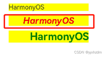
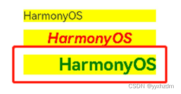
示例代码中包含两个Text组件,第一个使用的是默认样式,第二、三个自己给文本设置了一些文本样式。
@Entry
@Component
struct Index {
  @State message: string = 'Hello World';

  build() {
    Row() {
      Column() {
        Text('HarmonyOS')
        Text('HarmonyOS')
          .fontColor(Color.Red)
          .fontSize(22)
          .fontStyle(FontStyle.Italic)
          .fontWeight(FontWeight.Bold)
          .fontFamily('Arial')
        Text('HarmonyOS')
          .fontColor(Color.Green)
          .fontSize(26)
          .fontStyle(FontStyle.Normal)
          .fontWeight(700)
          .fontFamily('sans-serif')
      }
      .width('100%')
    }
    .height('100%')
  }
}
使用textAlign属性可以设置文本的对齐方式,示例代码如下:
@Entry
@Component
struct Index {
  @State message: string = 'Hello World';

  build() {
    Row() {
      Column() {
        Text('HarmonyOS')
          .width(200)
          .backgroundColor(Color.Yellow)
          .textAlign(TextAlign.Start)
        Text('HarmonyOS')
          .fontColor(Color.Red)
          .fontSize(22)
          .fontStyle(FontStyle.Italic)
          .fontWeight(FontWeight.Bold)
          .fontFamily('Arial')
          .width(200)
          .margin({ top: 12 })
          .backgroundColor(Color.Yellow)
          .textAlign(TextAlign.Center)
        Text('HarmonyOS')
          .fontColor(Color.Green)
          .fontSize(26)
          .fontStyle(FontStyle.Normal)
          .fontWeight(700)
          .fontFamily('sans-serif')
          .width(200)
          .margin({ top: 12 })
          .backgroundColor(Color.Yellow)
          .textAlign(TextAlign.End)
      }
      .width('100%')
    }
    .height('100%')
  }
}
textAlign参数类型为TextAlign,定义了以下几种类型:

- End:水平对齐尾部。
3、设置文本超长显示
当文本内容较多超出了Text组件范围的时候,您可以使用textOverflow设置文本截取方式,需配合maxLines使用,单独设置不生效,maxLines用于设置文本显示最大行数。下面的示例代码将textOverflow设置为Ellipsis ,它将显示不下的文本用 “…” 表示:
@Entry
@Component
struct Index {
  @State message: string = 'Hello World';

  build() {
    Row() {
      Column() {
        Text('This is the text content of Text Component This is the text content of Text Component')
        Blank(10)
        Text('This is the text content of Text Component This is the text content of Text Component')
          .fontSize(16)
          .maxLines(1)
          .textOverflow({ overflow: TextOverflow.Ellipsis })
          .backgroundColor(0xE6F2EE)

      }
      .width('100%')
    }
    .height('100%')
  }
}

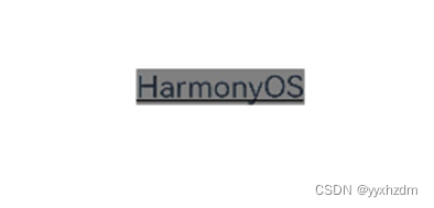
4、设置文本装饰线
使用decoration设置文本装饰线样式及其颜色,大家在浏览网页的时候经常可以看到装饰线,例如带有下划线超链接文本。
decoration包含type和color两个参数,其中type用于设置装饰线样式,参数类型为TextDecorationTyp,color为可选参数。
@Entry
@Component
struct Index {
  @State message: string = 'Hello World';

  build() {
    Row() {
      Column() {
        Text('HarmonyOS')
          .fontSize(20)
          .decoration({ type: TextDecorationType.Underline, color: Color.Black })
          .backgroundColor(Color.Gray)

      }
      .width('100%')
    }
    .height('100%')
  }
}

.decoration({ type: TextDecorationType.Overline, color: Color.Red })
.decoration({ type: TextDecorationType.LineThrough, color: Color.Red })
.decoration({ type: TextDecorationType.Underline, color: Color.Red })
原文地址:https://blog.csdn.net/yyxhzdm/article/details/134745839
本文来自互联网用户投稿,该文观点仅代表作者本人,不代表本站立场。本站仅提供信息存储空间服务,不拥有所有权,不承担相关法律责任。
如若转载,请注明出处:http://www.7code.cn/show_23550.html
如若内容造成侵权/违法违规/事实不符,请联系代码007邮箱:suwngjj01@126.com进行投诉反馈,一经查实,立即删除!