本文介绍: 设置文本的字体粗细,number类型取值[100, 900],取值间隔为100,默认为400,取值越大,字体越粗。string类型仅支持number类型取值的字符串形式,例如“400”,以及“bold”、“bolder”、“lighter”、“regular”、“medium”,分别对应FontWeight中相应的枚举值。使用多个字体,使用“,”进行分割,优先级按顺序生效。LoadingProgress组件用于显示加载进展,比如应用的登录界面,当我们点击登录的时候,显示的“正在登录”的进度条状态。
之——基础组件
杂谈


正文
1.Image
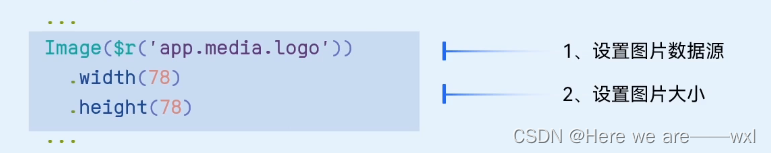
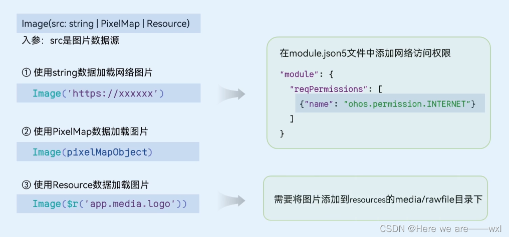
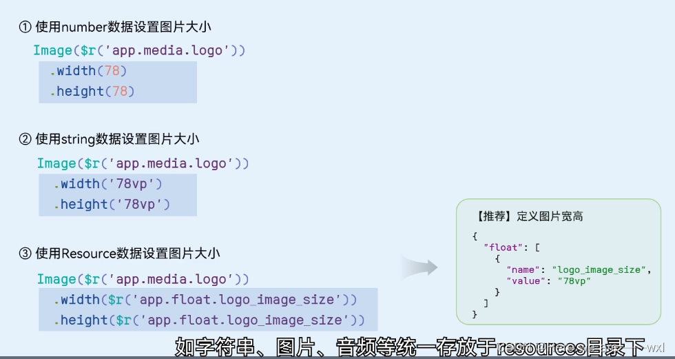
1.0 数据源
1.1 缩放
1.2 大小
1.3 网络图片
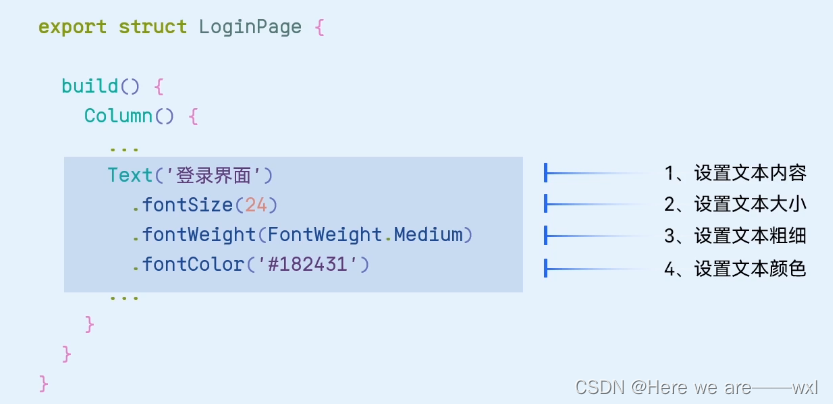
2.Text
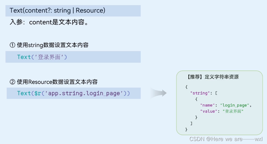
2.0 数据源
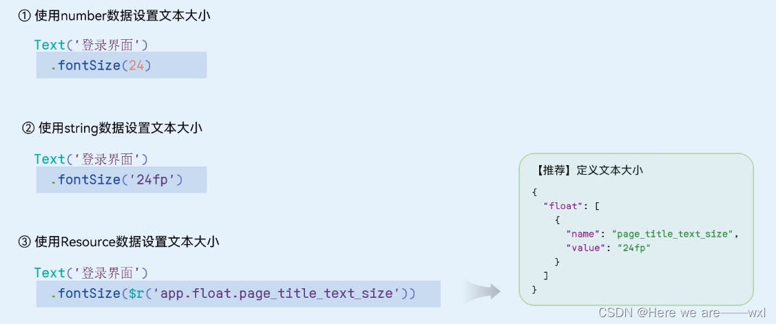
2.1 大小
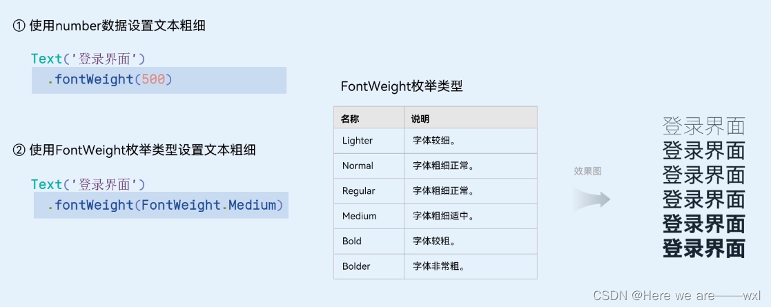
2.2 粗细
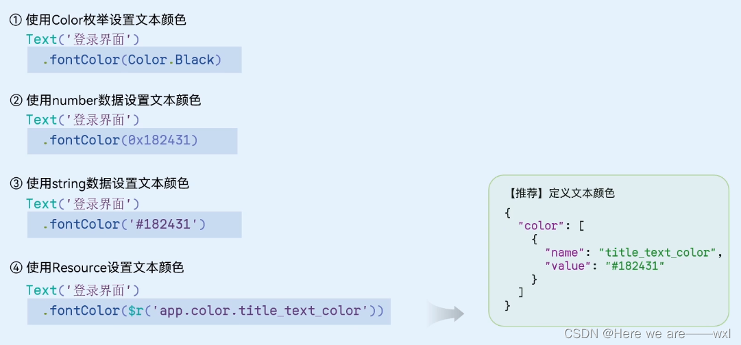
2.3 颜色
2.5 样式字体
2.6 基础示例

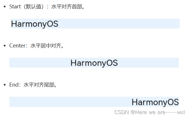
2.7 对齐
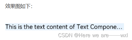
2.8 省略
2.9 划线
3.TextInput
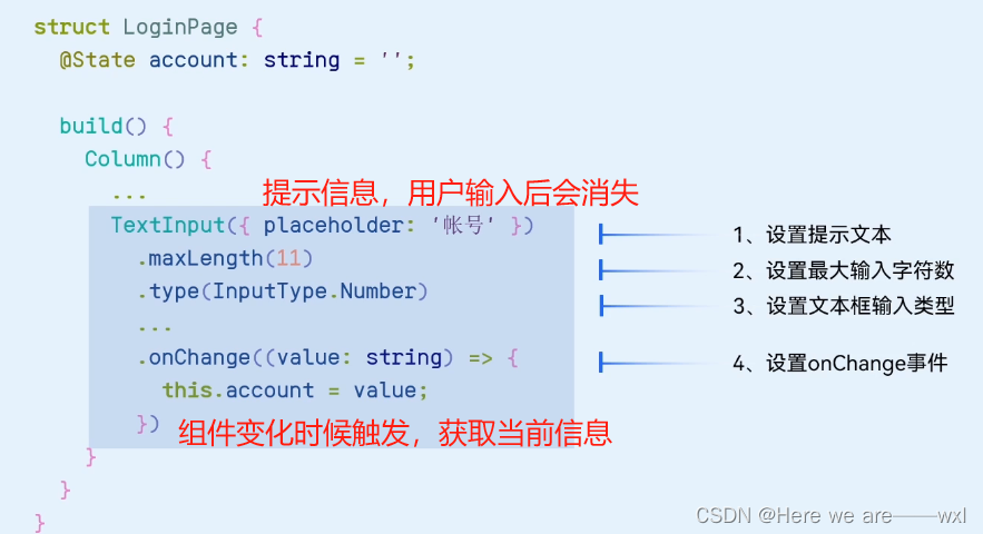
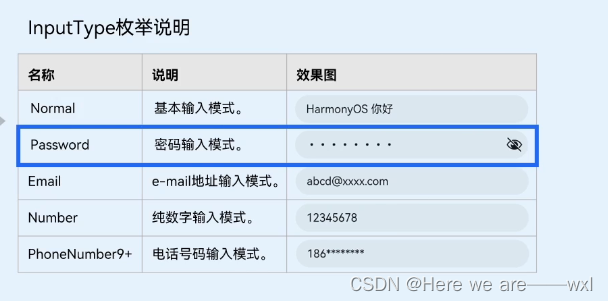
3.1 输入类型
3.2 提示文本属性
3.3 光标

4.Button
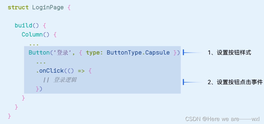
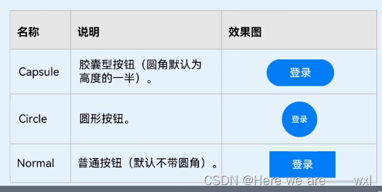
4.1 样式
4.2 子组件

5.LoadingProgress
声明:本站所有文章,如无特殊说明或标注,均为本站原创发布。任何个人或组织,在未征得本站同意时,禁止复制、盗用、采集、发布本站内容到任何网站、书籍等各类媒体平台。如若本站内容侵犯了原著者的合法权益,可联系我们进行处理。