本文介绍: 【七】CSS之弹性布局【1】什么是弹性布局随着技术的发展,那么在当前市场上,安装浏览器的客户端越来越多,设备也越来越多,所以CSS提供的布局,不仅应用于PC端,还可以应用于移动端设备例如:watch、ipad,mobile等,甚至包括机器人界面、智能屏、智能电视机、3D广告屏幕等等。也因此前端开发越来越需要一套代码就可以应用任何一种不同的屏幕下的样式。弹性布局,也叫Flex布局…
【七】CSS之弹性布局
【1】什么是弹性布局
- 随着技术的发展,那么在当前市场上,安装浏览器的客户端越来越多,设备也越来越多,所以CSS提供的布局,不仅应用于PC端,还可以应用于移动端设备
- 弹性布局,也叫Flex布局(Flexible Box)
- 任何一个html元素都可以指定为Flex盒模型。
.box{
   display: flex;  /* flex盒模型有2种,块级元素可以设置为flex盒模型,行内元素也可以通过 display: inline-flex; 设置为行级flex盒模型 */
}注意,当元素设为 Flex 布局元素以后,当前flex盒模型元素的子元素的
float、clear和vertical-align属性将失效,因为flex布局本身也提供了替代的属性。
【2】基本概念

【3】Flex容器的属性
| 属性 | 描述 |
|---|---|
| flex-direction | 决定主轴的方向(即项目的排列方向) |
| flex-wrap | 默认情况下,项目都排在一条线(又称”轴线”)上。flex-wrap属性定义,如果一条轴线排不下,如何换行。 |
| flex-flow | flex-flow属性是flex-direction属性和flex-wrap属性的简写形式,默认值为row nowrap。 |
| justify–content | 定义flex项目在主轴(x轴)上的对齐方式。 |
| align–items | 定义flex项目在交叉轴(y轴)上如何对齐。 |
| align–content | 定义多根轴线的对齐方式。如果项目只有一根轴线,该属性不起作用。 |
(1)flex-direction
| 属性值 | 描述 |
|---|---|
| row | 按行正向排列 |
| row-reverse | 按行翻转排列 |
| column | 按列正向排列 |
| column–reverse | 按列翻转排列 |
<!DOCTYPE html>
<html lang="en">
<head>
    <meta charset="UTF-8">
    <title>Title</title>
    <style>
    ul{display: flex;list-style: none;}
    li{width: 100px;height: 40px;margin: 5px;background: red;color: white;}
    .box1{flex-direction: row;}
    .box2{flex-direction: row-reverse;}
    .box3{flex-direction: column;}
    .box4{flex-direction: column-reverse;}
    </style>
</head>
<body>
    <ul class="box1">
      <li>1</li>
      <li>2</li>
      <li>3</li>
    </ul>

    <ul class="box2">
      <li>1</li>
      <li>2</li>
      <li>3</li>
    </ul>

    <ul class="box3">
      <li>1</li>
      <li>2</li>
      <li>3</li>
    </ul>

    <ul class="box4">
      <li>1</li>
      <li>2</li>
      <li>3</li>
    </ul>
</body>
</html>
(2)flex-wrap属性
| 属性值 | 描述 |
|---|---|
| nowrap | 默认值,不换行,压缩flex项目的宽度,让所有保持一行。 |
| wrap | 换行,不压缩flex项目的宽度,第一行在上方。 |
| wrap–reverse | 换行,不压缩flex项目的宽度,第一行在下方。 |
<!DOCTYPE html>
<html lang="en">
<head>
    <meta charset="UTF-8">
    <title>Title</title>
    <style>
    ul{display: flex;list-style: none;padding: 0; margin: 0; max-width: 360px;}
    li{width: 150px; height: 42px; line-height:42px; text-align: center; margin: 5px; background: red; color: white;}
    .box1{flex-direction: row; flex-wrap: nowrap;}
    .box2{flex-direction: row; flex-wrap: wrap; }
    .box3{flex-direction: row; flex-wrap: wrap-reverse; }
    </style>
</head>
<body>
    <ul class="box1">
      <li>1. 首页</li>
      <li>2. 商品</li>
      <li>3. 商品</li>
      <li>4. 用户</li>
    </ul>
    <hr>
    <ul class="box2">
      <li>1. 首页</li>
      <li>2. 商品</li>
      <li>3. 用户</li>
    </ul>
    <hr>
    <ul class="box3">
      <li>1. 首页</li>
      <li>2. 商品</li>
      <li>3. 用户</li>
    </ul>
</body>
</html>
(3)flex-flow
.box {
    flex-flow: <flex-direction> || <flex-wrap>;
}
<!DOCTYPE html>
<html lang="en">
<head>
<meta charset="UTF-8">
<title>Title</title>
<style>
ul{display: flex;list-style: none;padding: 0; margin: 0; max-width: 360px;}
li{width: 150px; height: 42px; line-height:42px; text-align: center; margin: 5px; background: red; color: white;}
.box1{flex-flow: row nowrap;}
.box2{flex-flow: row wrap; }
.box3{flex-flow: row wrap-reverse; }
</style>
</head>
<body>
<ul class="box1">
<li>1. 首页</li>
<li>2. 商品</li>
<li>3. 商品</li>
<li>4. 用户</li>
</ul>
<hr>
<ul class="box2">
<li>1. 首页</li>
<li>2. 商品</li>
<li>3. 用户</li>
</ul>
<hr>
<ul class="box3">
<li>1. 首页</li>
<li>2. 商品</li>
<li>3. 用户</li>
</ul>
</body>
</html>(4)justify–content属性
| 属性值 | 描述 |
|---|---|
flex-start |
在主轴(x轴)上以起点对齐(左对齐) |
flex-end |
在主轴(x轴)上以终点对齐(右对齐) |
center |
在主轴(x轴)上以中点对齐(居中对齐) |
space-between |
在主轴(x轴)上以两边对齐(两边对齐),平均分割元素之间的空隙,不保留最左与最右的空隙 |
| space-around | 在主轴(x轴)上以两边对齐(两边对齐),平均分割元素之间的空隙,保留最左与最右的空隙 |
<!DOCTYPE html>
<html lang="en">
<head>
    <meta charset="UTF-8">
    <title>Title</title>
    <style>
    ul{display: flex;list-style: none;padding: 0; margin: 0; max-width: 640px; background: gray;}
    li{width: 100px; height: 42px; line-height:42px; text-align: center; margin: 5px; background: red; color: white;}
    .box1{justify-content: flex-start;}
    .box2{justify-content: flex-end;}
    .box3{justify-content: center;}
    .box4{justify-content: space-between;}
    .box5{justify-content: space-around;}
    </style>
</head>
<body>
    <ul class="box1"><li>1. 首页</li><li>2. 商品</li><li>3. 用户</li></ul>
    <hr>
    <ul class="box2"><li>1. 首页</li><li>2. 商品</li><li>3. 用户</li></ul>
    <hr>
    <ul class="box3"><li>1. 首页</li><li>2. 商品</li><li>3. 用户</li></ul>
    <hr>
    <ul class="box4"><li>1. 首页</li><li>2. 商品</li><li>3. 用户</li></ul>
    <hr>
    <ul class="box5"><li>1. 首页</li><li>2. 商品</li><li>3. 用户</li></ul>
</body>
</html>
(5)align-items属性
| 属性值 | 描述 |
|---|---|
| flex-start | 居上对齐 |
| flex-end | 居下对齐 |
| center | 垂直居中对齐 |
| baseline | 基于文本底线对齐 |
| stretch | 基于flex容器的上下边拉伸对齐 |
<!DOCTYPE html>
<html lang="en">
<head>
    <meta charset="UTF-8">
    <title>Title</title>
    <style>
    ul{display: flex;list-style: none;padding: 0; margin: 0; max-width: 640px; height: 100px; background: gray;}
    li{width: 100px; min-height: 42px; line-height: 42px; text-align: center; margin: 5px; background: red; color: white;}
    .box1{align-items: flex-start;}
    .box2{align-items: flex-end;}
    .box3{align-items: center;}
    .box4{align-items: baseline}
    .box5{align-items: stretch}
    </style>
</head>
<body>
    <ul class="box1"><li>1. 首页</li><li>2. 商品</li><li>3. 用户</li></ul>
    <hr>
    <ul class="box2"><li>1. 首页</li><li>2. 商品</li><li>3. 用户</li></ul>
    <hr>
    <ul class="box3"><li>1. 首页</li><li>2. 商品</li><li>3. 用户</li></ul>
    <hr>
    <ul class="box4">
        <li>1. 页首页<br>首页页首页</li>
        <li>2. 商品商品商</li>
        <li style="line-height: 42px;height: 100px;">3. 用户</li>
    </ul>
    <hr>
    <ul class="box5" style="height: 150px;"><li>1. 首页</li><li>2. 商品</li><li>3. 用户</li></ul>
</body>
</html>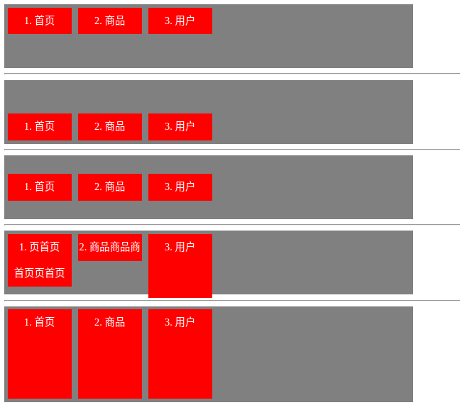
(6)align-content属性
| 属性值 | 描述 |
|---|---|
| flex-start | 多行居上排列 |
| flex-end | 多行居下排列 |
| center | 多行居中排列 |
| space-between | 多行平均行间空隙排列,不保留首行上方与末行下方空隙 |
| space-around | 多行平均行间空隙排列,保留首行上方与末行下方空隙 |
| stretch |
<!DOCTYPE html>
<html lang="en">
<head>
    <meta charset="UTF-8">
    <title>Title</title>
    <style>
    ul{display: flex; float: left; flex-wrap: wrap; list-style: none;padding: 0; margin: 0; margin-left: 50px; margin-bottom: 50px; max-width: 360px; height: 200px; background: gray;}
    li{width: 100px; min-height: 42px; line-height: 42px; text-align: center; margin: 5px; background: red; color: white;}
    .box1{align-content: flex-start;}
    .box2{align-content: flex-end;}
    .box3{align-content: center;}
    .box4{align-content: space-between}
    .box5{align-content: space-around}
    .box6{align-content: stretch}
    </style>
</head>
<body>
    <ul class="box1">
        <li>1. 首页</li>
        <li>2. 搜索</li>
        <li>3. 活动</li>
        <li>4. 订单</li>
        <li>5. 用户</li>
    </ul>
    <ul class="box2">
        <li>1. 首页</li>
        <li>2. 搜索</li>
        <li>3. 活动</li>
        <li>4. 订单</li>
        <li>5. 用户</li>
    </ul>
    <ul class="box3">
        <li>1. 首页</li>
        <li>2. 搜索</li>
        <li>3. 活动</li>
        <li>4. 订单</li>
        <li>5. 用户</li>
    </ul>
    <ul class="box4">
        <li>1. 首页</li>
        <li>2. 搜索</li>
        <li>3. 活动</li>
        <li>3. 活动</li>
        <li>3. 活动</li>
        <li>4. 订单</li>
        <li>5. 用户</li>
    </ul>
    <ul class="box5">
        <li>1. 首页</li>
        <li>2. 搜索</li>
        <li>3. 活动</li>
        <li>4. 订单</li>
        <li>5. 用户</li>
    </ul>
    <ul class="box6">
        <li>1. 首页</li>
        <li>2. 搜索</li>
        <li>3. 活动</li>
        <li>4. 订单</li>
        <li>5. 用户</li>
    </ul>
</body>
</html>
【4】Flex项目的属性
- 以下6个属性设置在项目上。
| 属性 | 描述 |
|---|---|
order |
定义flex项目的排列顺序。数值越小,排列越靠前,默认为0。 |
| flex-grow | 定义flex项目的放大比例,默认为0,即如果存在剩余空间,也不放大。 |
| flex-shrink | 定义flex项目的缩小比例,默认为1,即如果空间不足,该项目将缩小。 |
| flex-basis | 定义在分配多余空间之前,flex项目占据的主轴空间(main size)。 浏览器根据这个属性,计算主轴是否有多余空间。它的默认值为 auto,即flex项目的本来大小。 |
flex |
flex属性是flex-grow, flex-shrink 和 flex-basis的简写,默认值为0 1 auto。后两个属性可选。 |
align-self |
align-self属性允许单个flex项目有与其他flex项目不一样的对齐方式,可覆盖align-items属性。默认值为 auto,表示继承父元素的align-items属性,如果没有父元素,则等同于stretch。 |
(1)order属性
<!DOCTYPE html>
<html lang="en">
<head>
    <meta charset="UTF-8">
    <title>Title</title>
    <style>
    ul{display: flex; float: left; flex-wrap: wrap; list-style: none;padding: 0; margin: 0; margin-left: 50px; margin-bottom: 50px; max-width: 360px; height: 200px; background: gray;}
    li{width: 100px; min-height: 42px; line-height: 42px; text-align: center; margin: 5px; background: red; color: white;}
    .box1{align-content: flex-start;}
    .box1 li:nth-child(1){order: 2;}
    .box1 li:nth-child(2){order: 1;}
    .box1 li:nth-child(3){order: 5;}
    .box1 li:nth-child(4){order: 3;}
    .box1 li:nth-child(5){order: 4;}
    </style>
</head>
<body>
    <ul class="box1">
        <li>1. 首页</li>
        <li>2. 搜索</li>
        <li>3. 活动</li>
        <li>4. 订单</li>
        <li>5. 用户</li>
    </ul>
</body>
</html>
(2)flex-grow属性
-
如果所有项目的
flex-grow属性都为1,则它们将等分剩余空间(如果有的话)。
<!DOCTYPE html>
<html lang="en">
<head>
    <meta charset="UTF-8">
    <title>Title</title>
    <style>
    ul{display: flex; float: left; flex-wrap: wrap; list-style: none;padding: 0; margin: 0; margin-left: 50px; margin-bottom: 50px; width: 640px; height: 200px; background: gray;}
    li{width: 50px; min-height: 42px; line-height: 42px; text-align: center; margin: 5px; background: red; color: white;}
    .box1{align-content: flex-start;}
    .box1 li:nth-child(1){flex-grow: 1;}
    .box1 li:nth-child(2){flex-grow: 2;}
    .box1 li:nth-child(3){flex-grow: 1;}
    </style>
</head>
<body>
    <ul class="box1">
        <li>1. 首页</li>
        <li>2. 搜索</li>
        <li>3. 活动</li>
    </ul>
</body>
</html>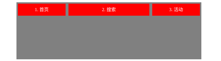
(3)flex-shrink属性
flex-shrink属性定义了项目的缩小比例,默认为1,即如果空间不足,该项目将缩小。- 负值对该属性无效。
- 如果所有项目的
flex-shrink属性都为1,当空间不足时,都将等比例缩小。 - 如果一个项目的
flex-shrink属性为0,其他项目都为1,则空间不足时,前者不缩小。
<!DOCTYPE html>
<html lang="en">
<head>
    <meta charset="UTF-8">
    <title>Title</title>
    <style>
    ul{display: flex; float: left; list-style: none; padding: 0; margin: 0; margin-left: 50px; margin-bottom: 50px; width: 640px; height: 200px; background: gray;}
    li{width: 150px; min-height: 42px; line-height: 42px; text-align: center; margin: 5px; background: red; color: white;}
    .box1{align-content: flex-start;}
    .box1 li:nth-child(1){flex-shrink: 1;}
    .box1 li:nth-child(2){flex-shrink: 0;}
    .box1 li:nth-child(3){flex-shrink: 2;}
    </style>
</head>
<body>
    <ul class="box1">
        <li>1. 首页</li>
        <li>2. 搜索</li>
        <li>3. 活动</li>
        <li>3. 活动</li>
        <li>3. 活动</li>
        <li>3. 活动</li>
    </ul>
</body>
</html>
(4)flex-basis属性
<!DOCTYPE html>
<html lang="en">
<head>
    <meta charset="UTF-8">
    <title>Title</title>
    <style>
    ul{display: flex; float: left; list-style: none; padding: 0; margin: 0; margin-left: 50px; margin-bottom: 50px; width: 360px; height: 200px; background: gray;}
    li{width: 150px; min-height: 42px; line-height: 42px; text-align: center; margin: 5px; background: red; color: white;}
    .box1{align-content: flex-start;}
    .box1 li:nth-child(1){flex-basis: 100px;}
    .box1 li:nth-child(2){flex-basis: 100px;}
    .box1 li:nth-child(3){flex-basis: 100px;}
    .box1 li:nth-child(4){flex-basis: 100px;}
    .box1 li:nth-child(5){flex-basis: 100px;}
    </style>
</head>
<body>
    <ul class="box1">
        <li>1. 首页</li>
        <li>2. 搜索</li>
        <li>3. 活动</li>
        <li>4. 订单</li>
        <li>5. 用户</li>
    </ul>
</body>
</html>
(5)flex属性
<!DOCTYPE html>
<html lang="en">
<head>
    <meta charset="UTF-8">
    <title>Title</title>
    <style>
    ul{display: flex; float: left; list-style: none; padding: 0; margin: 0; margin-left: 50px; margin-bottom: 50px; width: 640px; height: 200px; background: gray;}
    li{width: 150px; min-height: 42px; line-height: 42px; text-align: center; margin: 5px; background: red; color: white;}
    .box1{align-content: flex-start;}
    .box1 li:nth-child(1){flex: 1;}
    .box1 li:nth-child(2){flex: 1;}
    .box1 li:nth-child(3){flex: 1;}
    .box1 li:nth-child(4){flex: 1;}
    .box1 li:nth-child(5){flex: 2;}
    </style>
</head>
<body>
    <ul class="box1">
        <li>1. 首页</li>
        <li>2. 搜索</li>
        <li>3. 活动</li>
        <li>4. 订单</li>
        <li>5. 用户</li>
    </ul>
</body>
</html>
(6)align-self属性
align-self属性允许单个项目有与其他项目不一样的对齐方式,可覆盖align-items属性。- 默认值为
auto,表示继承父元素的align-items属性 - 该属性可能取6个值,除了auto,其他都与align-items属性完全一致。
| 属性值 | 描述 |
|---|---|
| auto | 默认值,表示当前flex项目集成父元素flex容器中的align-items的属性值 |
| flex-start | 居上对齐 |
| flex-end | 居下对齐 |
| center | 垂直居中对齐 |
| baseline | 基于首行文本的底线对齐 |
| stretch | 垂直拉伸元素的高度与父元素flex容器一致。 |
<!DOCTYPE html>
<html lang="en">
<head>
    <meta charset="UTF-8">
    <title>Title</title>
    <style>
    ul{display: flex;list-style: none;padding: 0; margin: 0; max-width: 640px; height: 100px; background: gray;}
    li{width: 100px; min-height: 42px; line-height: 42px; text-align: center; margin: 5px; background: red; color: white;}
    .box1{align-items: flex-start;}
    .box2{align-items: flex-end;}
    .box3{align-items: center;}
    .box4{align-items: baseline}
    .box5{align-items: stretch}
    .box1 li:nth-child(2){align-self: flex-end;}
    .box2 li:nth-child(2){align-self: stretch;}
    .box3 li:nth-child(2){align-self: flex-start;}
    .box3 li:nth-child(3){align-self: flex-end;}
    .box4 li:nth-child(2){align-self: stretch;}
    .box5 li:nth-child(2){align-self: center;}
    </style>
</head>
<body>
    <ul class="box1"><li>1. 首页</li><li>2. 商品</li><li>3. 用户</li></ul>
    <hr>
    <ul class="box2"><li>1. 首页</li><li>2. 商品</li><li>3. 用户</li></ul>
    <hr>
    <ul class="box3"><li>1. 首页</li><li>2. 商品</li><li>3. 用户</li></ul>
    <hr>
    <ul class="box4">
        <li>1. 页首页<br>首页页首页</li>
        <li>2. 商品商品商</li>
        <li style="line-height: 42px;height: 100px;">3. 用户</li>
    </ul>
    <hr>
    <ul class="box5" style="height: 150px;"><li>1. 首页</li><li>2. 商品</li><li>3. 用户</li></ul>
</body>
</html>
原文地址:https://blog.csdn.net/Chimengmeng/article/details/131547220
本文来自互联网用户投稿,该文观点仅代表作者本人,不代表本站立场。本站仅提供信息存储空间服务,不拥有所有权,不承担相关法律责任。
如若转载,请注明出处:http://www.7code.cn/show_30870.html
如若内容造成侵权/违法违规/事实不符,请联系代码007邮箱:suwngjj01@126.com进行投诉反馈,一经查实,立即删除!
声明:本站所有文章,如无特殊说明或标注,均为本站原创发布。任何个人或组织,在未征得本站同意时,禁止复制、盗用、采集、发布本站内容到任何网站、书籍等各类媒体平台。如若本站内容侵犯了原著者的合法权益,可联系我们进行处理。