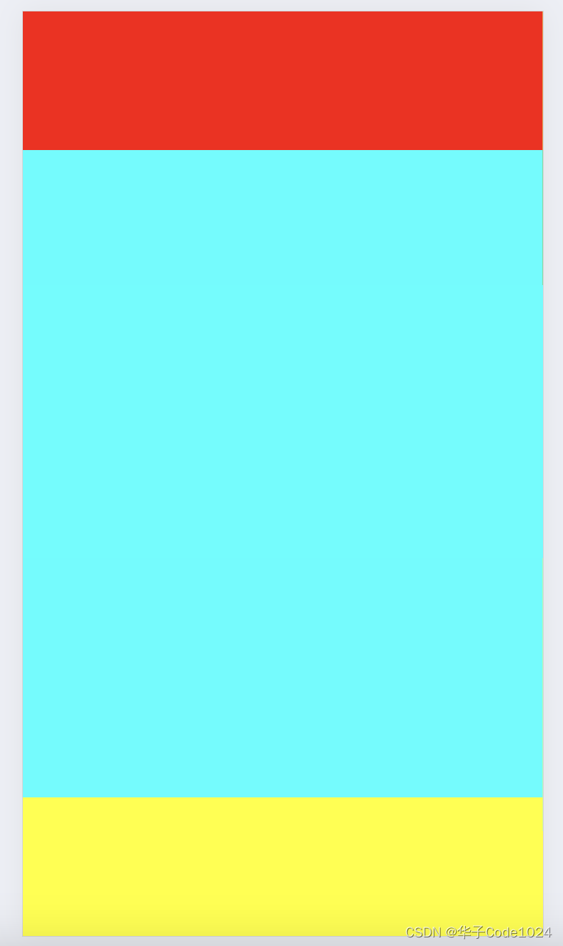
在学习html5 和css3的时候,用到了动画效果animation。
具体步骤是:
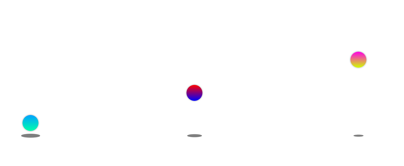
<div class="box">
<div class="box-content left"></div>
<div class="circle left1"></div>
</div>2. 设置外层盒子的样式,采用display属性,以列的形式进行排序。。
      .box {
            width: 100px;
            height: 300px;
            /* border: 1px solid #000; */
            margin:0 auto;
            display: flex;
            flex-direction: column;
            justify-content: flex-end;
            align-items: center;
        }
3. 设置小球样式,宽高各为50px,边框弧度为百分之50,背景颜色为渐变色,
     .box-content {
            width: 50px;
            height: 50px;
            /* border: 1px solid #000; */
            border-radius: 50%;
            /* margin: 20px auto; */
            background: linear-gradient(0deg,blue,red);
            box-shadow: 0 0 5px  rgba(0,0,0,0.5);
            animation: animal 2s infinite alternate linear;
}.circle{
width: 50px;
height: 10px;
background-color: rgba(0,0,0,0.5);
border-radius: 50%;
animation: animal1 2s infinite alternate linear;
} /* 小洞的动画效果 */
@keyframes animal1 {
0% {
transform: scale(1.2);
}
100% {
transform: scale(0.5);
}
}
/*小球的动画效果 */
@keyframes animal {
0% {
transform: translateY(0);
}
100% {
transform: translateY(-250px);
}
}
<!DOCTYPE html>
<html lang="en">
<head>
<meta charset="UTF-8">
<meta http-equiv="X-UA-Compatible" content="IE=edge">
<meta name="viewport" content="width=device-width, initial-scale=1.0">
<title>Document</title>
<style>
* {
margin: 0;
padding: 0;
}
body {
width: 100vw;
height: 100vh;
display: flex;
/* justify-content: flex-end; */
justify-content: center;
align-items: center;
}
.box {
width: 100px;
height: 300px;
/* border: 1px solid #000; */
margin:0 auto;
display: flex;
flex-direction: column;
justify-content: flex-end;
align-items: center;
}
.box-content {
width: 50px;
height: 50px;
/* border: 1px solid #000; */
border-radius: 50%;
/* margin: 20px auto; */
background: linear-gradient(0deg,blue,red);
box-shadow: 0 0 5px rgba(0,0,0,0.5);
animation: animal 2s infinite alternate linear;
}
.box .left {
background: linear-gradient(0deg,rgb(0, 255, 170),rgb(0, 162, 255));
animation-duration: 800ms;
}
.box .left1 {
animation-duration: 800ms;
}
.box .right {
background: linear-gradient(0deg,rgb(208, 255, 0),rgb(255, 0, 230));
animation-duration: 1s;
/* animation-delay: 50ms; */
}
.box .right1 {
animation-duration: 1s;
}
.circle{
            width: 50px;
            height: 10px;
            background-color: rgba(0,0,0,0.5);
            border-radius: 50%;
            animation: animal1 2s infinite alternate linear;
}
        /* 小洞的动画效果 */
        @keyframes animal1 {
              0% {
                 transform: scale(1.2);
              }
              100% {
                transform: scale(0.5);
              }
        }
        /*小球的动画效果 */
        @keyframes animal {
            0% {
                transform: translateY(0);
            }
            100% {
                transform: translateY(-250px);
            }
        }
</style>
</head>
<body>
<div class="box">
<div class="box-content left"></div>
<div class="circle left1"></div>
</div>
<div class="box">
<div class="box-content"></div>
<div class="circle"></div>
</div>
<div class="box">
<div class="box-content right"></div>
<div class="circle right1"></div>
</div>
</body>
</html>原文地址:https://blog.csdn.net/weixin_46378070/article/details/129164059
本文来自互联网用户投稿,该文观点仅代表作者本人,不代表本站立场。本站仅提供信息存储空间服务,不拥有所有权,不承担相关法律责任。
如若转载,请注明出处:http://www.7code.cn/show_32124.html
如若内容造成侵权/违法违规/事实不符,请联系代码007邮箱:suwngjj01@126.com进行投诉反馈,一经查实,立即删除!
声明:本站所有文章,如无特殊说明或标注,均为本站原创发布。任何个人或组织,在未征得本站同意时,禁止复制、盗用、采集、发布本站内容到任何网站、书籍等各类媒体平台。如若本站内容侵犯了原著者的合法权益,可联系我们进行处理。