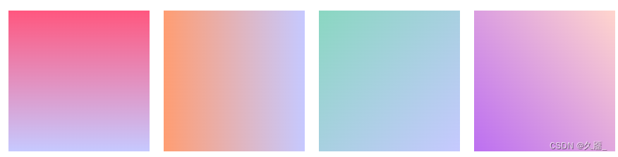
渐变属性
- linear–gradient 线性渐变
- repeating–linear–gradient 重复线性渐变
- radial–gradient 径向渐变
- repeating–radial–gradient 重复径向渐变
实例
<style>
.boxContent {
    width: 400px;
    height: 200px;
    margin: 20px;
    padding: 20px 0;
    box-sizing: border-box;
    text-align: center;
}
.boxContent.box1 {
    background: linear-gradient(to bottom, rgb(107, 175, 240), rgb(245, 137, 227));
}
</style>

<style>
.boxContent {
    width: 400px;
    height: 200px;
    margin: 20px;
    padding: 20px 0;
    box-sizing: border-box;
    text-align: center;
}
.boxContent.box2 {
    background: linear-gradient(to bottom right, rgb(107, 175, 240), rgb(245, 137, 227));
}
</style>

<style>
.boxContent {
    width: 400px;
    height: 200px;
    margin: 20px;
    padding: 20px 0;
    box-sizing: border-box;
    text-align: center;
}
.boxContent.box3 {
    background: linear-gradient(-30deg, rgb(107, 175, 240), rgb(245, 137, 227));
}
</style>

<style>
.boxContent {
    width: 400px;
    height: 200px;
    margin: 20px;
    padding: 20px 0;
    box-sizing: border-box;
    text-align: center;
}
.boxContent.box4 {
    background: linear-gradient(to bottom, rgb(107, 175, 240) 10%, rgb(245, 137, 227));
}
</style>

<style>
.boxContent {
    width: 400px;
    height: 200px;
    margin: 20px;
    padding: 20px 0;
    box-sizing: border-box;
    text-align: center;
}
.boxContent.box5 {
    background: linear-gradient(to bottom, rgb(107, 175, 240) 10%, rgb(245, 137, 227) 60%);
}
</style>

<style>
.boxContent {
    width: 400px;
    height: 200px;
    margin: 20px;
    padding: 20px 0;
    box-sizing: border-box;
    text-align: center;
}
.boxContent.box6 {
    background: linear-gradient(to bottom, rgba(107, 175, 240, 0.5), rgba(245, 137, 227, 1));
}
</style>

<style>
.boxContent {
    width: 400px;
    height: 200px;
    margin: 20px;
    padding: 20px 0;
    box-sizing: border-box;
    text-align: center;
}
.boxContent.box7 {
    background: repeating-linear-gradient(to right, rgb(255, 255, 255), rgb(107, 175, 240) 40%, rgb(245, 137, 227) 50%);
}
</style>

<style>
.boxContent {
    width: 400px;
    height: 200px;
    margin: 20px;
    padding: 20px 0;
    box-sizing: border-box;
    text-align: center;
}
.boxContent.box8 {
    background: radial-gradient(rgb(107, 175, 240), rgb(245, 137, 227));
}
</style>

<style>
.boxContent {
    width: 400px;
    height: 200px;
    margin: 20px;
    padding: 20px 0;
    box-sizing: border-box;
    text-align: center;
}
.boxContent.box9 {
    background: radial-gradient(circle, rgb(107, 175, 240), rgb(245, 137, 227));
}
</style>

<style>
.boxContent {
    width: 400px;
    height: 200px;
    margin: 20px;
    padding: 20px 0;
    box-sizing: border-box;
    text-align: center;
}
.boxContent.box10 {
    background: linear-gradient(to bottom, rgb(107, 175, 240), rgb(245, 137, 227));
    -webkit-background-clip: text;
    -webkit-text-fill-color: transparent;
    font-weight: bold;
    font-size: 80px;
}
</style>

原文地址:https://blog.csdn.net/weixin_42154189/article/details/126406630
本文来自互联网用户投稿,该文观点仅代表作者本人,不代表本站立场。本站仅提供信息存储空间服务,不拥有所有权,不承担相关法律责任。
如若转载,请注明出处:http://www.7code.cn/show_32386.html
如若内容造成侵权/违法违规/事实不符,请联系代码007邮箱:suwngjj01@126.com进行投诉反馈,一经查实,立即删除!
主题授权提示:请在后台主题设置-主题授权-激活主题的正版授权,授权购买:RiTheme官网
声明:本站所有文章,如无特殊说明或标注,均为本站原创发布。任何个人或组织,在未征得本站同意时,禁止复制、盗用、采集、发布本站内容到任何网站、书籍等各类媒体平台。如若本站内容侵犯了原著者的合法权益,可联系我们进行处理。
