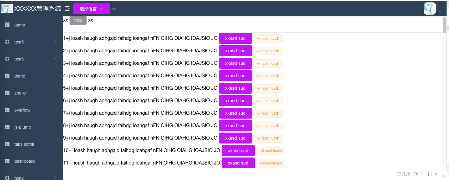
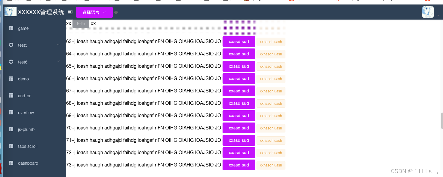
效果如图:当浏览器滚轮在最上面的时候 没什么区别。当鼠标滚轮超出最上面高度时会有这种粒子感。吸顶遮盖下面内容
首先要 明确 css 基础属性 position: sticky;的用法。再了解
background-image: radial-gradient(transparent 1px, #fff 1px);
background-size: 4px 4px;
backdrop-filter: saturate(50%) blur(4px);
<template>
<div style="height: 500px; overflow: auto">
<div class="top-div">
<div>
xx
<el-button type="info" size="mini">htllo</el-button>
xx
</div>
</div>
<div>
<div v-for="item in indexArr" :key="item" style="margin-bottom: 5px">
{{ item }}+j ioash haugh adhgajd faihdg ioahgaf nFN OIHG OIAHG IOAJSIO JO
<el-button type="primary">xxasd sud</el-button>
<el-tag type="warning">xxhasdhiuash </el-tag>
</div>
</div>
</div>
</template>
<script>
export default {
data() {
return {
indexArr: [],
};
},
mounted() {
setTimeout(() => {
for (let i = 1; i <= 100; i++) {
this.indexArr.push(i);
}
}, 1000);
},
methods: {},
};
</script>
<style lang='scss'>
.top-div {
position: sticky;
top: 0;
left: 0;
height: 55px;
border-bottom: 1px solid #ccc;
background-image: radial-gradient(transparent 1px, #fff 1px);
background-size: 4px 4px;
backdrop-filter: saturate(50%) blur(4px);
}
</style>
原文地址:https://blog.csdn.net/qq_37167049/article/details/133708383
本文来自互联网用户投稿,该文观点仅代表作者本人,不代表本站立场。本站仅提供信息存储空间服务,不拥有所有权,不承担相关法律责任。
如若转载,请注明出处:http://www.7code.cn/show_40352.html
如若内容造成侵权/违法违规/事实不符,请联系代码007邮箱:suwngjj01@126.com进行投诉反馈,一经查实,立即删除!
声明:本站所有文章,如无特殊说明或标注,均为本站原创发布。任何个人或组织,在未征得本站同意时,禁止复制、盗用、采集、发布本站内容到任何网站、书籍等各类媒体平台。如若本站内容侵犯了原著者的合法权益,可联系我们进行处理。