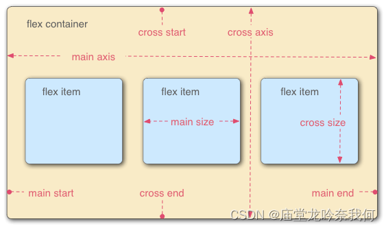
本文介绍: 以下文章主要探讨 HTML5 中 CSS3 提供的用来实现未来响应式弹性伸缩布局方案。一、flex布局的语法块级元素 :display: flex ———— 将容器盒模型作为块级弹性伸缩盒显示行内元素 :display: inline–flex ———— 将容器盒模型作为内联级弹性伸缩盒显示设置flex布局后,flex item的float、clear和vertical-align 属性都失效flex布局默认为横向二、容器属性flex的排列属性:元素名称 说明
一、flex布局的语法
块级元素 :display: flex ———— 将容器盒模型作为块级弹性伸缩盒显示
行内元素 :display: inline–flex ———— 将容器盒模型作为内联级弹性伸缩盒显示
设置flex布局后,flex item的float、clear和vertical-align 属性都失效
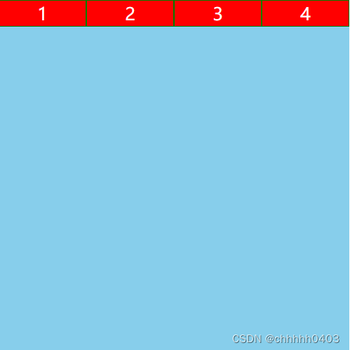
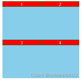
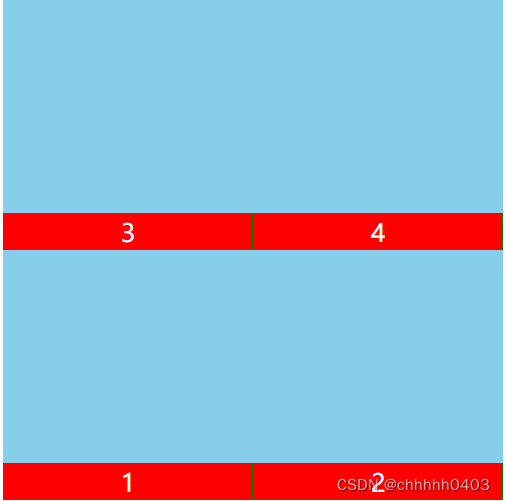
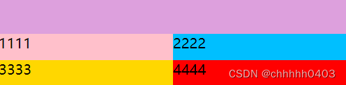
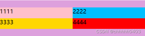
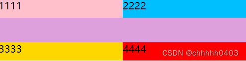
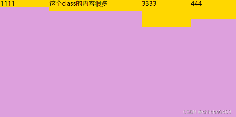
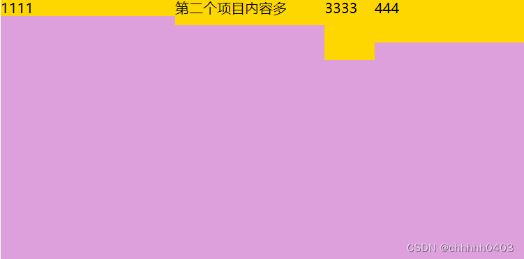
二、容器属性
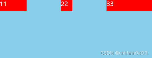
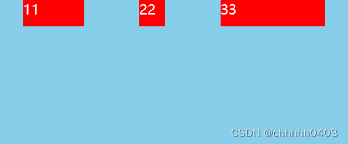
flex的排列属性:
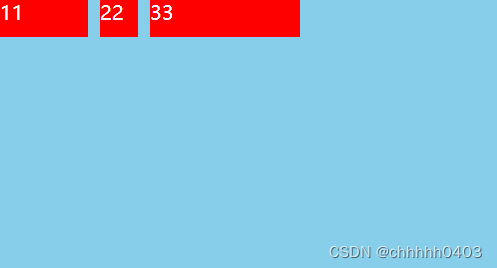
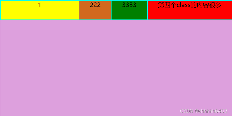
flex换行属性:
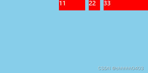
伸缩属性:
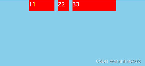
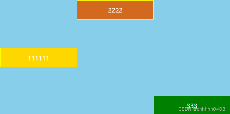
align–items属性: ———— 处理伸缩项目容器的额外空间
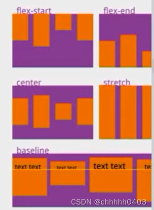
align-content属性: ———— 定义了多根轴线对齐方式
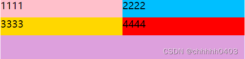


三、项目属性

声明:本站所有文章,如无特殊说明或标注,均为本站原创发布。任何个人或组织,在未征得本站同意时,禁止复制、盗用、采集、发布本站内容到任何网站、书籍等各类媒体平台。如若本站内容侵犯了原著者的合法权益,可联系我们进行处理。