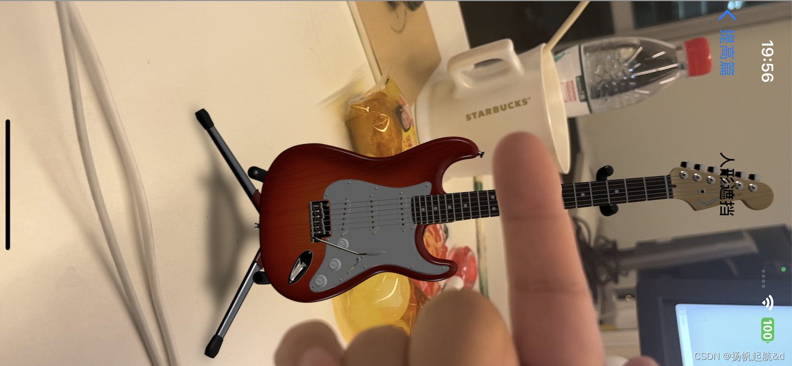
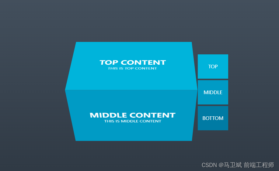
上图
<!DOCTYPE html>
<html lang="en">
<head>
<meta charset="UTF-8">
<title>3D旋转tab图</title>
<style>
* {
margin: 0;
padding: 0;
}
body {
height: 100vh;
background: linear-gradient(to top, #29323c, #485563);
}
.container {
width: 500px;
display: flex;
position: absolute;
left: 50%;
top: 50%;
transform: translate(-45%, -50%);
color: #ffffff;
text-transform: uppercase;
perspective: 1300px;
}
input {
display: none;
}
.labels {
height: 250px;
display: flex;
flex-direction: column;
justify-content: space-between;
}
.tab {
width: 100px;
height: 80px;
line-height: 80px;
text-align: center;
cursor: pointer;
}
.tab:nth-child(1) {
background-color: #00b4db;
}
.tab:nth-child(2) {
background-color: #009bc5;
}
.tab:nth-child(3) {
background-color: #007ba4;
}
.content {
width: 95%;
height: 230px;
position: absolute;
display: flex;
justify-content: center;
align-items: center;
flex-direction: column;
background-color: red;
}
.content h1 {
font-size: 28px;
}
.content p {
font-size: 14px;
}
.content:nth-child(1) {
background-color: #00b4db;
transform: rotateX(-270deg) translateY(-115px);
transform-origin: top center;
}
.content:nth-child(2) {
background-color: #009bc5;
transform: translateZ(115px);
}
.content:nth-child(3) {
background-color: #007ba4;
transform: rotateX(-90deg) translateY(115px);
transform-origin: bottom center;
}
.cube {
position: relative;
flex: 1;
transform-style: preserve-3d;
transition: transform 0.5s ease-in;
}
#top:checked ~ .cube {
transform: rotateX(-90deg);
}
#middle:checked ~ .cube {
transform: rotateX(0deg) translateY(10px);
}
#bottom:checked ~ .cube {
transform: rotateX(90deg);
}
</style>
</head>
<body>
<div class="container">
<input type="radio" name="tabs" id="top" checked/>
<input type="radio" name="tabs" id="middle"/>
<input type="radio" name="tabs" id="bottom"/>
<div class="cube">
<div class="content">
<h1>top content</h1>
<p>this is top content</p>
</div>
<div class="content">
<h1>middle content</h1>
<p>this is middle content</p>
</div>
<div class="content">
<h1>bottom content</h1>
<p>this is bottom content</p>
</div>
</div>
<div class="labels">
<label for="top" class="tab">top</label>
<label for="middle" class="tab">middle</label>
<label for="bottom" class="tab">bottom</label>
</div>
</div>
</body>
</html>
原文地址:https://blog.csdn.net/qq_35350009/article/details/134778706
本文来自互联网用户投稿,该文观点仅代表作者本人,不代表本站立场。本站仅提供信息存储空间服务,不拥有所有权,不承担相关法律责任。
如若转载,请注明出处:http://www.7code.cn/show_41936.html
如若内容造成侵权/违法违规/事实不符,请联系代码007邮箱:suwngjj01@126.com进行投诉反馈,一经查实,立即删除!
声明:本站所有文章,如无特殊说明或标注,均为本站原创发布。任何个人或组织,在未征得本站同意时,禁止复制、盗用、采集、发布本站内容到任何网站、书籍等各类媒体平台。如若本站内容侵犯了原著者的合法权益,可联系我们进行处理。