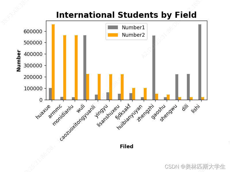
当前位置: 首页pandas正文 本文介绍: pandas笔记 pandas的分组对比柱状图 先说下思路 原表是有两列需要对比的数据,number和number2 排序,按照number2进行排序sort_values 关键的在于将两个对比的数据plt.bar写成list就可以 在做一些样式的调整 import pandas as pd import matplotlib.pyplot as plt students = pd.read_excel('D:/Pandas/Various.xlsx') # 按照number排序,然后从大到小排序 students.sort_values(by='Number2', inplace=True, ascending=False) # 一个横坐标一个纵坐标,还有颜色的 设置柱状图颜色 students.plot.bar(x='Field' ,y=['Number1','Number2'], color=['grey','orange']) # rotation的值只有horizontal,和vertical,90是不行的,就是一个纵排一个横排 ax = plt.gca() ax.set_xticklabels(students['Field'],rotation=45,ha = 'right') # 设置横坐标和纵坐标的标题 plt.xlabel('Filed',fontweight ='bold') plt.ylabel('Number',fontweight ='bold') plt.title('International Students by Field',fontsize= '16',fontweight ='bold') # 设置图表移动 f = plt.gcf() f.subplots_adjust(left=0.2,bottom=0.42) plt.show() 结果: 写代码的时候不明白 set_xticklabels和subplots_adjust不能关联出来。这么长还不能关联。 原文地址:https://blog.csdn.net/zhangyysp/article/details/127651748 本文来自互联网用户投稿,该文观点仅代表作者本人,不代表本站立场。本站仅提供信息存储空间服务,不拥有所有权,不承担相关法律责任。 如若转载,请注明出处:http://www.7code.cn/show_44406.html 如若内容造成侵权/违法违规/事实不符,请联系代码007邮箱:suwngjj01@126.com进行投诉反馈,一经查实,立即删除! 主题授权提示:请在后台主题设置-主题授权-激活主题的正版授权,授权购买:RiTheme官网显示所有内容声明:本站所有文章,如无特殊说明或标注,均为本站原创发布。任何个人或组织,在未征得本站同意时,禁止复制、盗用、采集、发布本站内容到任何网站、书籍等各类媒体平台。如若本站内容侵犯了原著者的合法权益,可联系我们进行处理。numberpandas排序 代码007普通 打赏 收藏 海报 链接