Java 基于 Apache ECharts 实现:柱状图、折线图、环形图等案例
柱状图
效果图

源代码
<!DOCTYPE html>
<html>
<head>
<meta charset="utf-8">
<meta http-equiv="X-UA-Compatible" content="IE=edge" />
<meta name="viewport" content="width=device-width,initial-scale=1.0" />
<title></title>
<!-- 01 导入js -->
<!-- <script src="js/echarts.min.js"></script> -->
<script src="https://cdn.bootcss.com/echarts/4.1.0.rc2/echarts.js" type="text/javascript" charset="utf-8"></script>
<!-- 03 设置容器的样式 -->
<style>
#container{
width: 800px;
height: 600px;
}
</style>
</head>
<body>
<!-- 02 创建个容器 -->
<div id="container"></div>
</body>
<script>
//04 实例化echarts
// 4.1 创建一个实例
var echart = echarts.init(document.getElementById("container"), 'light');
// 4.2 定义配置项
var option = {
// 图表的标题
title:{
text:"统方记录"
},
// 图表的提示
tooltip:{},
// 图例
// legend:{data:["统方记录"]},
// x轴线
xAxis:{data:["2022-11","2022-12","2023-01","2023-02","2023-03","2023-04"]},
// y轴线
yAxis:{},
// 设置数据
series:[
{
// 数据名称
name:"统方记录",
// 类型为柱状图
type:"bar",
color:['rgb(58 160 255 / 91%)'],
// 数据data
data:["8","10","4","5","9","4"]
}
]
}
// 4.3 更新配置
echart.setOption(option);
// chart图表,set设置 Option选项 data数据 type类型 bar条(柱状条),series系列(数据) Axis轴线 xAxis水平轴线
// legend传奇(图例) tooltip 提示 init初始化 document文档
</script>
</html>
复用
如果想复用上面的代码,只需要把xAxis和series的data改下就行。
折线图
效果图

源代码
<!DOCTYPE html>
<html>
	<head>
		<meta charset="utf-8">
		<title></title>
		<script src="https://cdn.bootcss.com/echarts/4.1.0.rc2/echarts.js" type="text/javascript" charset="utf-8"></script>
		<style>
		 #container{
			 width: 500px;
			 height: 260px;
		 }
		</style>
	</head>
	<body>
		<div id="container"></div>
		<script>
			var echart = echarts.init(document.getElementById("container"),'light');
			var option = {
			    legend:{
			        data: ["A级", "B级", "C级"],
			        bottom: 0,
			        textStyle: {
			        	fontSize: 16,
			        	color:'#999'
			        }
			    },
			    // 图表的提示
				tooltip:{
					trigger: 'axis'
				},
			    xAxis: {
			        type: 'category',
			        axisLine: {  // 坐标轴线
			            lineStyle: {
			                color: '#C2C2C2'
			            }
			        },
			        // axisLabel: { // 坐标轴刻度标签
			        //     color: '#999',
			        //     //fontWeight: 'bold',
			        //     // fontSize: 14
			        // },
			        data: ["2020-11-16", "2020-11-17", "2020-11-18", "2020-11-19", "2020-11-20", "2020-11-21", "2020-11-22"]
			    },
			    yAxis: {
			        type: 'value',
			        axisLine: {  // 坐标轴线
			            lineStyle: {
			                color: '#FFFFFF'
			            }
			        },
			        axisLabel: { // 坐标轴刻度标签
			            color: '#999',
			            //fontWeight: 'bold',
			            // fontSize: 14
			        },
			        splitLine: {  // 分隔线
			            lineStyle: {
			                type: 'dotted',
			                color: '#eee',
			                // show: false
			            }
			        },
			    },
			    series: [
			        {
			            data: [33.5,45.6,60.9,96.6,31.6,45.9,33.5],
			            name: "A级",
			            // smooth: true,
			            // color:['rgb(58 160 255 / 91%)'],
			            type: "line"
			        },
			        {
			            data: [13.9,10.8,83.9,88.5,10,81.3,38.5],
			            name: "B级",
			            // smooth: true,
			            // color:['rgb(64 199 104)'],
			            type: "line"
			        },
			        {
			            data: [93.5,45.6,27.9,29.6,21.6,14.9,23.5],
			            name: "C级",
			            // smooth: true,
			            // color:['rgb(250 211 52)'],
			            type: "line"
			        }
			    ]
			}
			echart.setOption(option);
		</script>
	</body>
</html>
复用
如果想复用上面的代码,只需要把xAxis和series改下就行。
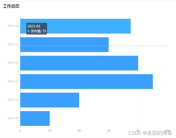
横向柱状图
效果图
源代码
<!DOCTYPE html>
<html>
	<head>
		<meta charset="utf-8">
		<title></title>
		<script src="https://cdn.bootcss.com/echarts/4.1.0.rc2/echarts.js" type="text/javascript" charset="utf-8"></script>
		<style>
		 #container{
			 width: 800px;
			 height: 600px;
		 }
		</style>
	</head>
	<body>
		<div id="container"></div>
		<script>
			var echart = echarts.init(document.getElementById("container"),'light')
			var option = {
				title:{text:"工作动态"},
				// legend:{data:["发布量"]},
				// tooltip提示  trigger触发器 axis轴线触发,item 当前项触发
				tooltip:{trigger:"axis"},
					yAxis:{
						axisLine: {  // 坐标轴线
		                lineStyle: {
		                    color: '#C2C2C2'
		                }
		            },
					data:["2022-10","2022-11","2022-12","2023-01","2023-02","2023-03"]},
				xAxis:{
					axisLine: {  // 坐标轴线
		                lineStyle: {
		                    color: '#FFFFFF'
		                }
		            },
		            axisLabel: { // 坐标轴刻度标签
		                color: '#999',
		                //fontWeight: 'bold',
		                // fontSize: 14
		            },
		            splitLine: {  // 分隔线
		                lineStyle: {
		                    type: 'dotted',
		                    color: '#eee',
		                    // show: false
		                }
		            },
				},
				series:[
					{
						name:"发布量",
						type:"bar",
						color:"#3aa0ff",
						data:[20,40,90,80,60,75],
						stack:true,
						// stack堆叠,label 标签,position位置,inside内部,right右侧,formmater格式
						// n 代表换行,{a}系列名 "陈康" {b}数值名 "vue"  {c}数值  80
					    label:{show:false,position:"insideRight",formatter:"{a}n{c}分"}}
				]
			}
			echart.setOption(option);
		</script>
	</body>
</html>
复用
如果想复用上面的代码,只需要把tooltip的data和series的data改下就行。
环形图
效果图

源代码
<!DOCTYPE html>
<html>
	<head>
		<meta charset="utf-8">
		<title></title>
		<script src="https://cdn.bootcss.com/echarts/4.1.0.rc2/echarts.js" type="text/javascript" charset="utf-8"></script>
		<style>
		 #container{
			 width: 603px;
			 height: 180px;
			 padding-bottom:50px;
		 }
		</style>
	</head>
	<body>
		<div id="container"></div>
		<script>
			var echart = echarts.init(document.getElementById("container"), 'light')
			var option = {
			    // title: {
			    //     text: '各商品销量占比',
			    //     subtext: 'A商场情况分析',
			    //     left: 'center'
			    // },
			    tooltip: {
			        trigger: 'item',
			        // formatter: '{a} <br/>{b} : {c} ({d}%)'
			        // formatter: '{b}: {c} ({d}%)'
			        formatter: '{b}: ({d}%)'
			    },
		        label: {
		            show: true,
		            formatter: '{b}: {d}%'
		        },
			    legend: {
			    	// type: 'scroll',
			        // orient: 'horizontal', // 水平布局
			        // align: 'left', // 图例组件在容器中水平对齐方式
			        // left: 10, // 图例组件离容器左侧的距离
			        // top: 10, // 图例组件离容器顶部的距离
			        // itemWidth: 14,
			        // itemHeight: 5,
			        // formatter: function (name) {
			        //     // 如果需要,这里可以自定义图例文本的格式
			        //     return name;
			        // },
			        type: 'scroll',
			        align: 'left', // 图例组件在容器中水平对齐方式
			        // left: 10, // 图例组件离容器左侧的距离
			        // top: 160,
			        bottom: 0, // 图例组件离容器顶部的距离
			        // left: 'center',
					// bottom: 'center',
					// selectedMode: false,
					// bottom: -30,
					orient: 'horizontal',
			        data: ["处方点评",
			        	"抗生素使用情况",
			        	"医用耗材、试剂",
			        	"大型医疗设备检查",
			        	"医疗收费",
			        	"廉洁行医",
			        	"统方管理"]
			    },
			    series: [
			        {
			            // name: '所售商品',
			            type: 'pie',
			            radius: ['50%', '70%'],
			            data: [
			                 {
						      "value" : 10,
						      "name" : "处方点评"
						    },
						    {
						      "value" : 20,
						      "name" : "抗生素使用情况"
						    },
						    {
						      "value" : 30,
						      "name" : "医用耗材、试剂"
						    },
						    {
						      "value" : 40,
						      "name" : "大型医疗设备检查"
						    },
						    {
						      "value" : 50,
						      "name" : "医疗收费"
						    },
						    {
						      "value" : 70,
						      "name" : "廉洁行医"
						    },
						    {
						      "value" : 80,
						      "name" : "统方管理"
						    }
			            ],
			        }
			    ]
			};
			echart.setOption(option);
		</script>
	</body>
</html>
复用
如果想复用上面的代码,只需要把legend的data和series的data改下就行。
参考
https://echarts.apache.org/zh/index.html
原文地址:https://blog.csdn.net/sxdtzhaoxinguo/article/details/131191628
本文来自互联网用户投稿,该文观点仅代表作者本人,不代表本站立场。本站仅提供信息存储空间服务,不拥有所有权,不承担相关法律责任。
如若转载,请注明出处:http://www.7code.cn/show_49659.html
如若内容造成侵权/违法违规/事实不符,请联系代码007邮箱:suwngjj01@126.com进行投诉反馈,一经查实,立即删除!
主题授权提示:请在后台主题设置-主题授权-激活主题的正版授权,授权购买:RiTheme官网
声明:本站所有文章,如无特殊说明或标注,均为本站原创发布。任何个人或组织,在未征得本站同意时,禁止复制、盗用、采集、发布本站内容到任何网站、书籍等各类媒体平台。如若本站内容侵犯了原著者的合法权益,可联系我们进行处理。


![[设计模式Java实现附plantuml源码~行为型]请求的链式处理——职责链模式](https://img-blog.csdnimg.cn/direct/699aac3ed0c446d088772a0ed4c444ed.png)
![[设计模式Java实现附plantuml源码~结构型]处理多维度变化——桥接模式](https://img-blog.csdnimg.cn/direct/8e811a73550d49e6a55c49a070a733e8.png)